01 — Mesotech International
Transforming the digital presence of an aviation technology company
UX Strategy · Brand Experience · Content Strategy
2021 – 2023
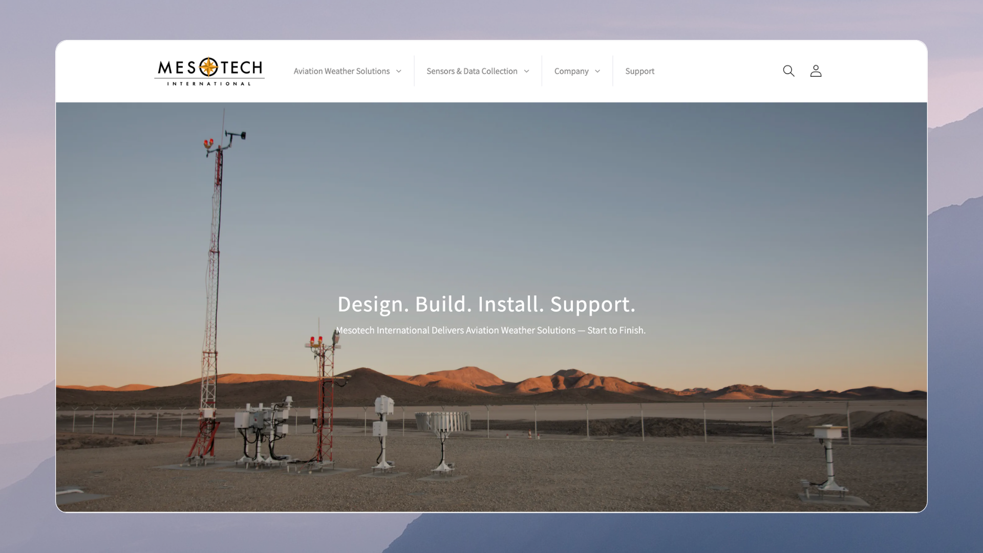
Mesotech had decades of aviation expertise and sophisticated technology, but its digital presence didn't reflect the company it had become. I led a ground-up redesign that transformed the website from 27 pages into a 120+ page digital ecosystem, introduced a customer Knowledge Base, improved accessibility and navigation, and strengthened Mesotech's visibility and credibility in the aviation industry.
Impact: 27 → 120+ pages · 40% increase in resource engagement · New customer Knowledge Base
The Short Version
The website wasn't telling the same story as the company.
When I joined Mesotech, I quickly noticed a disconnect.
The company was building sophisticated aviation weather technology for airports, government agencies, and the U.S. military, but you wouldn't necessarily know that from its website.
Mesotech wasn't new to aviation. It was competing in an established industry against companies with longer histories and stronger brand recognition. The opportunity wasn't simply to make the website look better.
We needed Mesotech's digital presence to reflect the credibility, expertise, and innovation that already existed inside the company.
I started with clarity, not aesthetics.
The existing site had 27 pages, limited technical resources, inconsistent navigation, and no central destination for customers looking for support or product information.
Through usability work, customer feedback, and conversations across the company, I started seeing the same issue from different angles:
People didn't necessarily need more information. They needed a better way to find and understand it.
That changed how I approached the redesign.
Instead of starting with a visual refresh, I began reorganizing the experience around what customers actually came to Mesotech to accomplish.
A website became an ecosystem.
The project grew substantially.
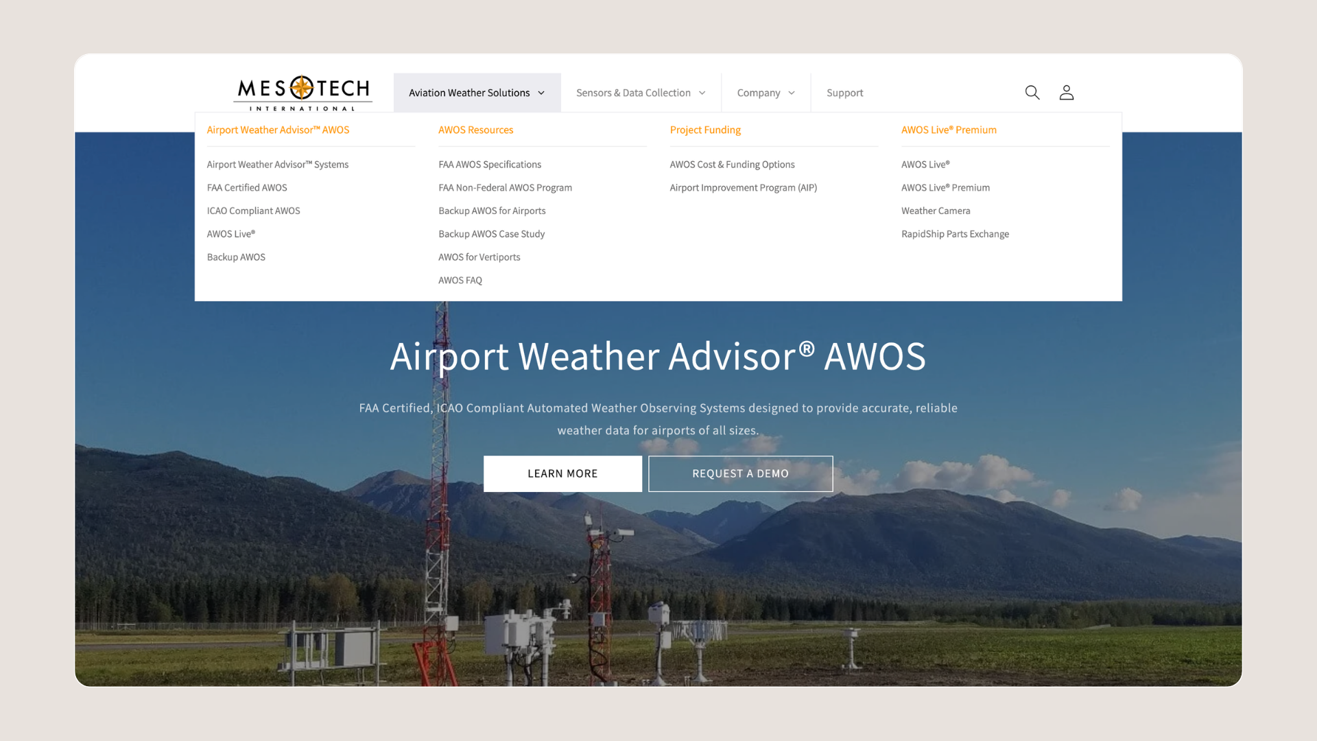
I redesigned the information architecture and navigation, refreshed the visual language, rewrote and reorganized content, improved accessibility, and created a scalable structure for products, company news, educational content, and technical resources.
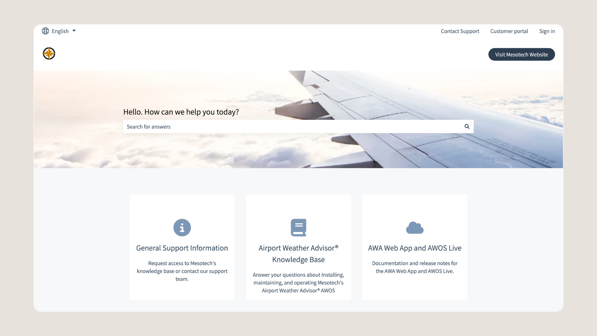
One of the most important additions was a dedicated Knowledge Base, giving technicians and customers a central place to access documentation, brochures, and other resources without hunting for them.
In less than two years, the site grew from 27 pages to more than 120.
But the page count wasn't the real accomplishment.
The important part was that the additional content had somewhere logical to live.
What changed
27 → 120+
pages within a scalable information architecture
40% ↑
resource downloads and blog readership
1 NEW Knowledge Base
giving customers and technicians easier access to critical resources
The redesigned experience also gave marketing, sales, and customer support a much stronger digital foundation.
Perhaps my favorite feedback came from Mesotech's CEO, who felt the redesign helped put the company "on the map" as a more recognizable and reputable player in its industry.
That meant more to me than simply launching a prettier website.
What stayed with me
This project changed how I think about design.
What initially looked like a website problem turned out to be a clarity and perception problem.
Mesotech already had the expertise. My job was to make that expertise easier for people to see, understand, and trust.
That's a lesson I've carried into almost everything I've built since.